How to Choose the Right Color Palette for Your Home
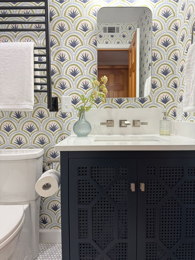
Color is the decision that homeowners worry about most, and the one that interior designers have spent the most time thinking through on their behalf. There is no single correct answer — a warm ivory that glows in a sun-filled Zionsville kitchen can look flat and chalky in a north-facing Indianapolis study — but there are clear principles that take the guesswork out of the process and help you arrive at a palette you will genuinely love to live with.
At BK Interior Design, color selection is never done in isolation. We look at your lighting, your existing fixed elements like flooring and stone, the architecture of the home, and how the rooms connect to each other before we ever hold a chip to the wall. The result is a palette that feels personal, cohesive, and lasting.
Start With the Fixed Elements You Cannot Change
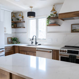
Before you choose a single paint color, inventory what is already in the room: the flooring, countertops, tile, cabinetry, brick, or any architectural feature you are keeping. These fixed elements have undertones — often warm (red, yellow, orange) or cool (blue, green, gray) — and your paint palette needs to work with those undertones rather than fight them.
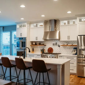
A common mistake is choosing a paint color in isolation from a small chip in a brightly lit paint store, then bringing it home to find it clashes with the honey oak floor or looks green next to white marble. Always sample colors in the actual room, applied in a large swatch on the wall, and view them in both daylight and evening artificial light before committing.
Understand How Undertones Work
Every paint color — including whites and off-whites — carries an undertone. A color labeled simply as “warm white” may lean distinctly yellow, pink, or peach in real light. A grey that looks sophisticated in the can can reveal a strong purple or green cast on your walls. Understanding undertones is how designers avoid these surprises.
To find the undertone of any color, hold it next to a true neutral. If the sample looks yellower, it has a warm undertone. If it looks greener or bluer, it has a cool undertone. Warm undertones tend to feel more inviting and cozy; cool undertones feel crisp, calm, and airy. Neither is better — the right choice depends on the room's purpose, its natural light, and the fixed materials already in place.
For open-plan homes in the Carmel or Westfield area, where rooms flow into each other without hard boundaries, keeping undertones consistent across adjacent spaces is the single most reliable way to create a sense of cohesion without using identical colors throughout.
Build a Palette, Not a Single Color
A home color palette is typically built from three layers: a dominant neutral that covers the largest surfaces (walls, ceilings, trim), a secondary tone used in accent walls, upholstery, or cabinetry, and one or two accent colors that appear in accessories, art, and textiles. This 60-30-10 framework keeps the palette from feeling chaotic while still allowing personality and variety.
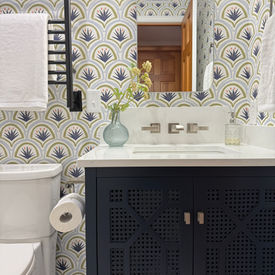
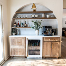
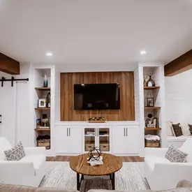
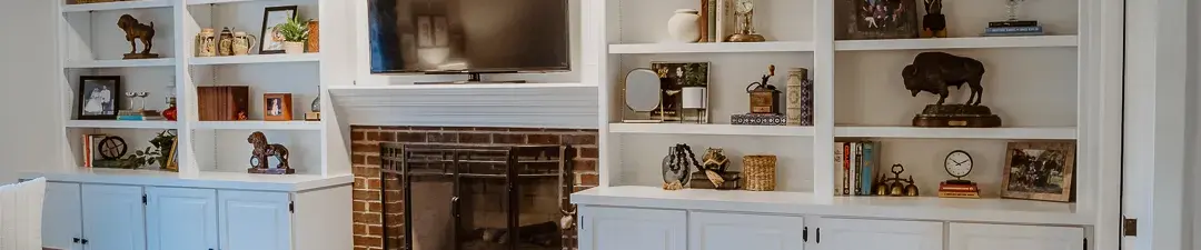
The dominant neutral does not have to be white. Warm greige, soft sage, pale clay, and quiet blue-grey all work beautifully as primary wall tones and create far more atmosphere than a generic bright white. Save the crisp whites for trim and ceilings, where they provide contrast and crispness without dominating the space.
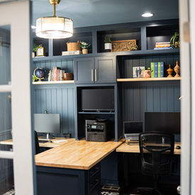
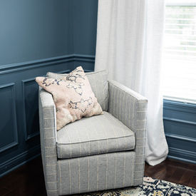
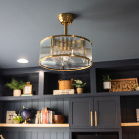
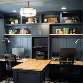
Accent colors are where you can afford to be bolder. A deep navy on a built-in bookcase, a terracotta throw pillow, or a sage green linen curtain panel can bring energy and intention to a room without the commitment of a wall-to-wall color you might tire of. Because accessories are the easiest element to swap, this is where trends can be acknowledged without being chased.
Consider the Flow Between Rooms
In a home with an open floor plan, or one where you can see from one room into the next, the palette needs to transition thoughtfully. Abrupt color shifts at doorways — a warm cream in the hallway suddenly meeting a stark cool grey in the living room — create visual tension that makes a home feel disjointed rather than curated.
One approach is to choose a base neutral and use it throughout the main living areas, then shift the secondary and accent tones from room to room to create individual character while maintaining a through-line. Another approach is a tonal progression: a slightly deeper or lighter version of the same hue as you move from space to space, so each room feels connected but distinct.
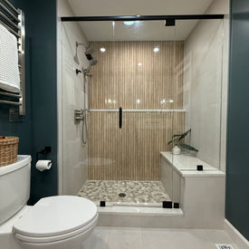
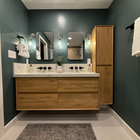
For Zionsville and Indianapolis homes with multiple bedrooms and private spaces, those rooms have more latitude to express a mood all their own, since the expectation is that you enter a separate, self-contained environment. A moody blue-green primary bedroom can coexist with a warm neutral open plan if the threshold makes the transition feel deliberate rather than accidental.
Natural Light Changes Everything
The orientation of your windows is one of the most important factors in color selection. North-facing rooms receive cool, indirect light all day; colors that look balanced in a showroom can feel cold or flat in these spaces. Warm undertones — creams, warm whites, honey yellows, soft terracottas — compensate for the cool light and keep north-facing rooms from feeling clinical. South-facing rooms bathe in warm, direct light; they can take cooler tones without looking icy, and they also show the truest representation of paint colors throughout the day.
East-facing rooms are brightest in the morning and cooler by afternoon. West-facing rooms glow warmly in the evening and can look quite dark in the morning. If a room is used primarily at a certain time of day, sample colors at that time to see how they will actually look when the room is in use.
When to Call in a Professional
Color selection feels deceptively simple until you are standing in a room with twelve paint chips and no clear winner. A professional interior designer does not just choose colors by instinct — she brings a systematic understanding of light, undertones, material relationships, and how a palette will hold up visually over time. For a whole-home color consultation or a renovation where finishes and paint need to align, working with a designer from the beginning saves the cost of repainting decisions that did not land as expected.